The original:

Cropped, and note that I have dulled down the fence, which was too obtrusive.

Now I've gotten rid of the fence entirely. I wrote over the fence with leaves.... This wouldn't work (or would have been a LOT harder) if the leaves were crisp. But as they are very soft-focus, it was do-able (though it took a while). I also got rid of that light area in the lower right corner.
In addition, I increased the contrast quite a lot.
I just love being able to mess with stuff like this. My end result is SO much less dependent on luck.........
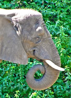
This is almost the same as the previous one, but I've lowered the saturation of the greens about 30%, to see if I like that better (showcasing the elephant more, and the leaves less).
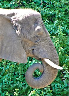
This one has the contrast pushed all the way up. I like it.

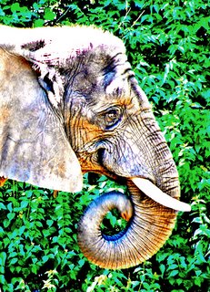
And here the saturation of greens and cyans has been lowered about 30%. I don't think I like this as well as the previous one........






No comments:
Post a Comment