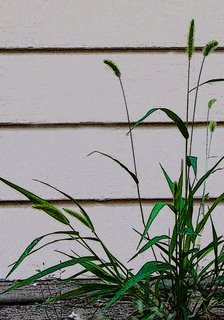
What I did to this pic: I was working so hard to get my nose near the ground to get the bottom of the plant that I didn't notice how tilted the camera was, relative to the siding. Straightened. I also wasn't paying any attention to the blue-green hose between the plant and the house. Hose color desaturated. Plant's greens' saturation raised. Poster edges added, which does nice things for the plant but makes the house look horrible. Understand that this is an attempt at Art, not Documentation, ok?
(Why didn't I just go back out and get a better pic? Pouring down rain, that's why, in addition to curiosity about what I can do to make pedestrian shots more interesting....)

Update: July 14, 2006
The more I looked at that previous pic, the less I liked it.
I've cleaned up the noise on the house, and have cropped it a lot tighter. I don't think this is great, but I like it better....







No comments:
Post a Comment