Of course I love orange. I love pretty much any bright saturated color. I love putting the colors together.
What I love best of all is contrast. Color contrast. Value contrast.
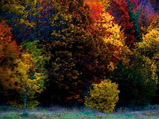
Here's the peak of Michigan fall color, with the saturation seriously oomphed.






9 comments:
I can't tell you how much I miss the fall colors!! Don't miss the snow....but miss fall. I grew up in Michigan and can remember the cider mill and those "eat 'em by the dozen" cider mill donuts. Beautiful picture! Karin
Yum---love what you did with these colors!
Great picture! I love the deep violet with the red!
What a beautiful picture -- I could sit here all day looking at it's deep richness!
This is a fabulous picture - and you can knit socks too! That is a leap of faith I still have to take.:)
There's nothing quite like fall colors. Blustery days, leaves swirling down, long drives to see all the beautiful trees...sigh. Next year we'll see it again, right? Time for snowmen now!
Thank you for the kind words! I am pretty happy with this image (still wondering if I think there is too much pale stuff at the bottom?) I love the cyan in this image. It was one of the unexpected touches when I boosted the saturation. :-)
Knitting in the round is really the only tricky thing about socks. I like it better than back and forth, now, but had to learn a whole new way to hold the needles, back when I learned..... Aside from that, socks is just increasing and decreasing.... :-)
I need to get the heel organized on the orange sock. I have it on the needles; just need to put the stitch markers on so I know where to decrease, and then it will be pretty mindless......
Beautiful picture. I love the colors.
Simply gorgeous!
Post a Comment