Grabbed two images that were interesting in different places within the rectangle.
This.
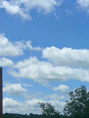
And this.
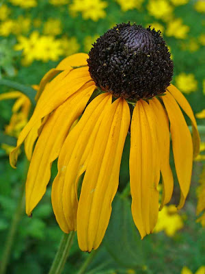
Settled on a "color burn" blend.
Lightened shadows (a lot) and raised "midtone contrast" on both the sky layer and the black-eyed susan layer. Cropped a bit off the left and the bottom.
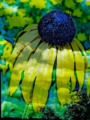
Hmm. Now that's what I'm talking about.
But. Too boring on that cloud section. What can we put over the whole thing to sort of liven things up?
How about this (made some time ago using scribbler).....
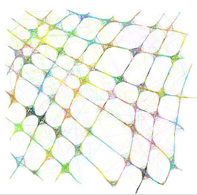
Ok. Quite liking this.........
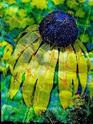
This is the first digital mix thing I've done that has felt loose and spontaneous.
The way I want this stuff to feel.
Yay.
.






3 comments:
Isn't PS cool! I really like the things you've done; you are so creative. I know i kind of shocked myself when i discovered my PS style was very different than my hands on art.
My old art: cards and abs, atc's etc) was mostly with someone else in mind for giving or for trades so i created according to that persons life, preferences and themes.
I feel more like me with every piece i make now because its just for me and that realization is so freeing.
Thanks!
"Just for me" really does make a difference, doesn't it!
I generally do very minimal work.
The stenciling class I took with Mary Ann Moss last year was a real departure ... layers, business, stuff and more stuff goin' on.....
Definitely not my usual "thing."
I have been wanting to go more in that direction, digitally, so am pleased that I finally got something I feel good about.
:-)
Hey, Lorraina, I hope you see this -- I have tried to leave you comments many times, and somehow they all get lost.
Blogger is not keeping them, not letting me post them, I think....
Post a Comment