Not exactly a demo; more like step-outs, I guess.....
The original image. (click on any pic to see a bigger version)
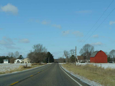
I used the clone stamp to write clean cloud over the spot-on-windshield almost in the center.

Poster-edge filter applied. Note that it put dark speckles in the sky.... I don't like 'em.
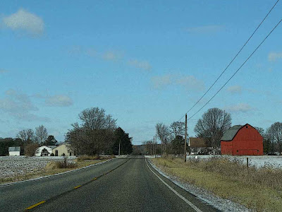
Undo the poster-edges (one click on the edit button). Select the sky (using the magic wand, clicking as many times as I need to. Invert the selection (select all the not-sky). Add to the selection anything on the ground (the snow, say) that was deselected (the snow was deselected when the white clouds got deselected).
Apply the poster-edges filter again, to just the selected area.
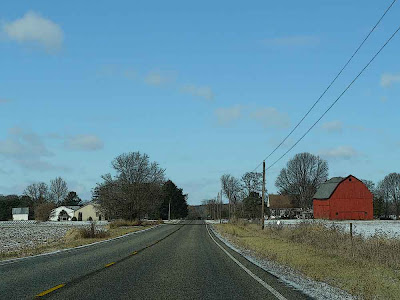
Use enhance/lighting/shadows-highlights to lighten the shadows a bit.
And voila.
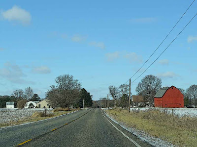
It can be hard to see just what the poster-edging is doing, unless you click on the pics to see the bigger versions. Here is a tighter crop that shows all of this a bit more clearly.
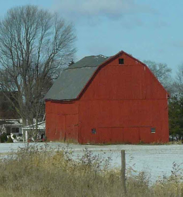
Poster-edges, including sky.
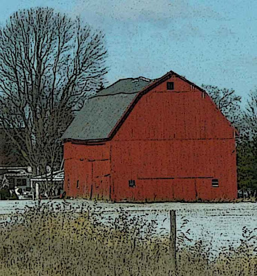
Poster-edges, on all but sky.

Shadows lightened a bit........
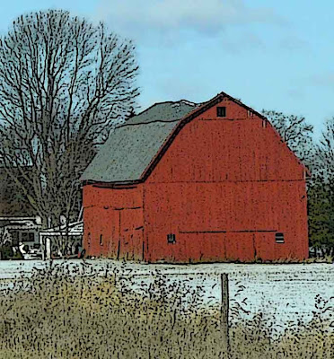
None of this takes any time. Clickety-click, not even two minutes for all of these steps together.....
.






3 comments:
HELLO ORANGE, I LEFT YOU AN AWARD ON MY BLOG BECAUSE YOU BRIGHTEN MY DAY EVERYDAY. ENJOY! FRANÇOISE
The poster edge makes this pic look like a Currier and Ives Christmas card.
I really like the effect every time I see you use it.
Thanks very much, Francoise! I'll be there momentarily.
Thanks, Leslie!
I get on jags where I want to use one filter or another all the time.... I really like what poster-edging does in cases like these where things aren't crystal-clear (sharpness-wise). Lots of pics which ought to have sharp lines (trees!) benefit a lot, imh, from poster-edging.
I'm happy that my definition of "a good photograph" doesn't mean I have to live with exactly what the camera captures.
:-)
Post a Comment