Original image. I prefer to put the main focal point in a corner rather than in the middle, and let's lose that light area at the top right.
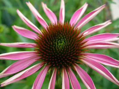
Cropped.
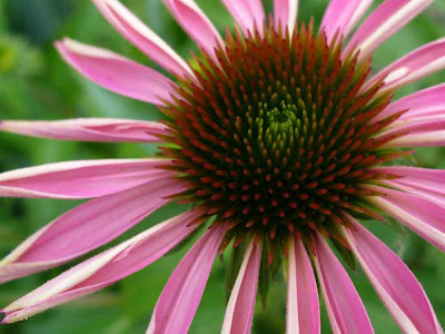
I started messing with this right after the black&white stenciling images I made on July 3, so ... remove the color (which I didn't save a copy of), and then in the "filters" "adjustments" menu, "posterize." I can't remember how many values this is (the "posterize" choice has a slider, which goes from exactly two values up to so many I can't tell "posterize" from the original.............).
Kinda soft and dreamy.................
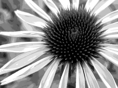
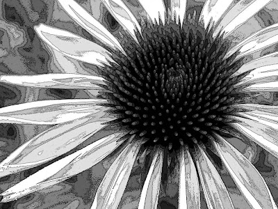
What if we go into the "artistic" filters and get out good old "poster edges"?
I rather like this -- sort of psychedelic, in a black&white way.........
You knew I couldn't leave color alone for long. I went back to the cropped image above, and used "enhance" "lighting" "shadows/highlights" to lessen the shadows.
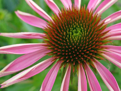
"filters" "adjustments" "posterized" -- if I remember correctly, the slider was on 8
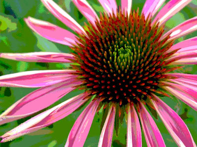
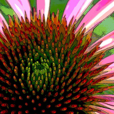
the above, with "filters" "artistic" "poster edges"
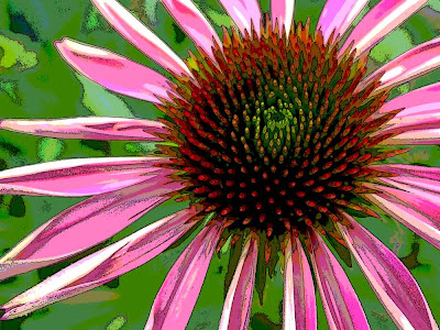
New crop of the posterized image.

And poster-edged.
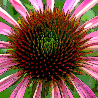
Yet another crop of the posterized image.
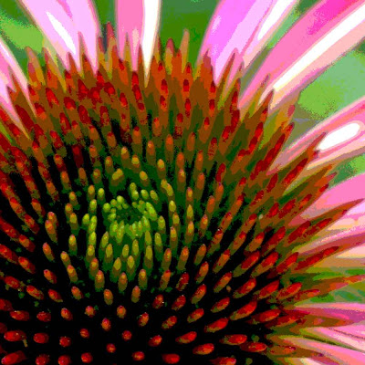
And poster-edged.
I love these colors. The greens. The hot pinks. The oranges. And the chartreuse in the center.
One of the things I really like about messing with images is that I can see Right Now what happens. Even better, I haven't damaged my original by messing with it to see "what happens if....."......
.






8 comments:
What a fun post! I need to find some time (if I can ever figure out where I put it.....) to play with some of my photoshopping.
I bet your sheep ate it. Or maybe the emus?
It's about my favorite thing to do, playing with my pics..........
:-)
As always, your images are both beautiful and interesting. I like playing with the black and white option because the result produces a completely different response.
Hurrah for photoshop! and for you the photographer, of course.
Françoise
[blush]
Thanks!
It is really color that floats my boat, but every once in a while I make a foray into b&w..... So nice to have a choice.............
I absolutely LOVE that I can try so many different things -- WITHOUT any risk to my original.
:-)
Thanks for leaving a comment on my blog. I love the way your artistic eye works and how you see flowers, perhaps because I, too, love getting up close and personal with them. You understand photoshop way better than I do.
hmmmmm, I'm seeing stencil....
Thanks, Jo.
I have been using Photoshop Elements intensively for 4.5 years. There is SO much you can do ... it takes a while to figure out which of the myriad things you can do are things you actually *like* to do.
I know there is a lot that I don't know about. Adobe has excellent "classroom in a book" books. I keep meaning to work through the one for version 6 (which is what I have now). I did the version 3 one a few years ago. I know I would learn good things if I were to do the version 6 one.
The only thing I am aware of that you can do with full Photoshop that you can't do with Elements is get things set up to be professionally printed (colors and so on). Since I don't do that.....
Elements is under $100, and the full version is several times that, I think.
I'm seeing stencils (and masks!) everywhere, too, Steph. :-)
One of the things that interests me is how little information our brains need to identify something.
A couple of dots and a curved line segment -- a smiley face.
Three line segments that intersect in the middle -- a flower......
I was thinking that a bunch of strips of cardstock, punched more or less in the middle and joined with a brad, would make an excellent mask that would read "flower"............
And because the strips weren't fixed to each other, it would look a bit different each time............
:-)
Post a Comment